First
task with the “uscrime” dataset
Comments : Here we can find some boxplots showing the number of assaults in different regions of the USA. They also show some relevant characteristics such as the mean, the median, the extremal values. Moreover we can see an outlier.
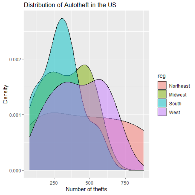
Comments : This plot shows the repartition of the number of auto thefts in the USA depending on the 4 regions. It shows us a portion where the real number has chances to be.
Second
task
Coding part
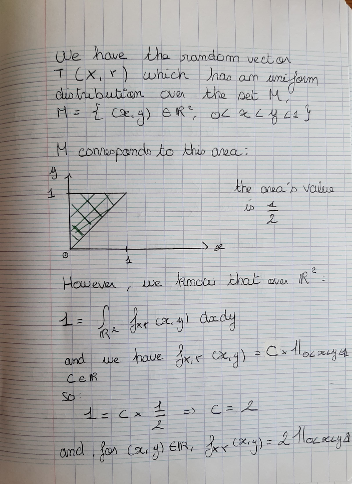
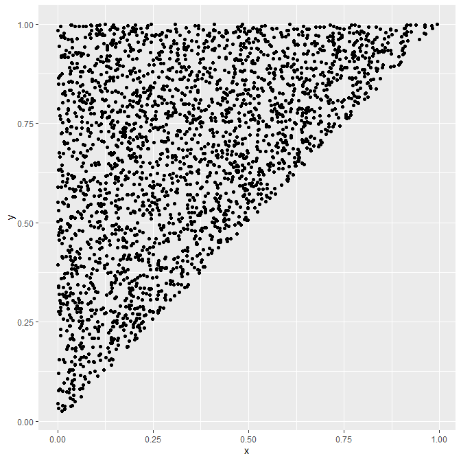
First of all, let us simulate our two dimensional random sample from the joint distribution :
We see that the points are all in the set M defined before.
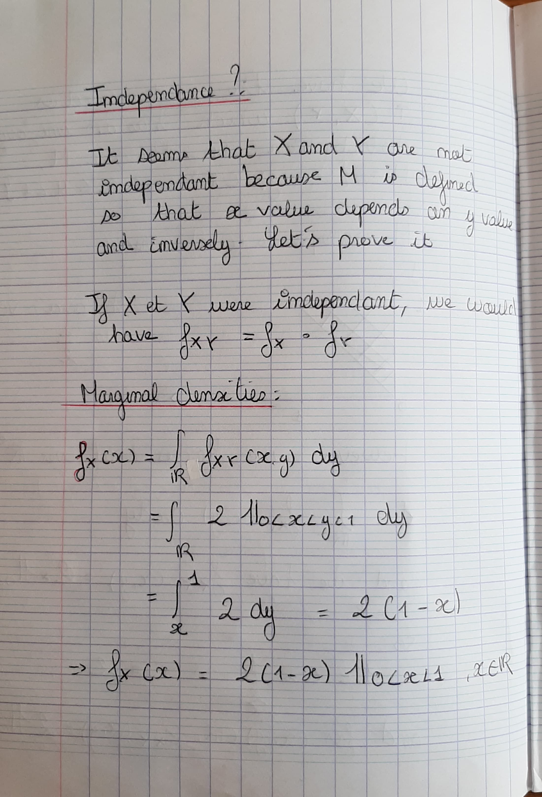
Now
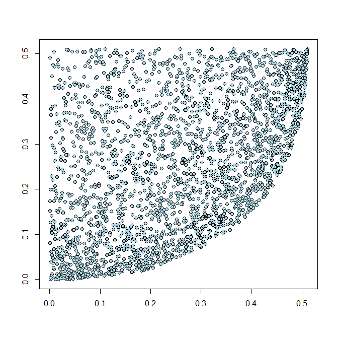
let us try to visualize the non-independence of the two
variables by plotting (x,y) as shown in the lesson :
We can see that there are cluster areas, X and Y are indeed not independent.
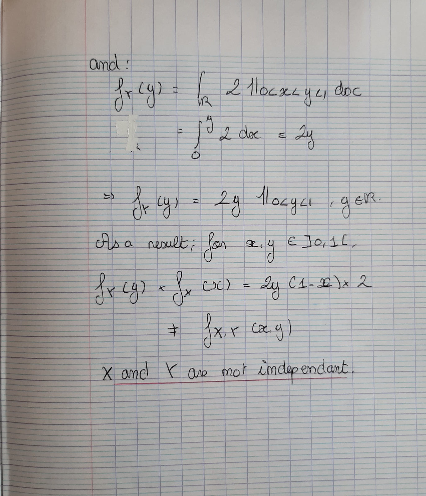
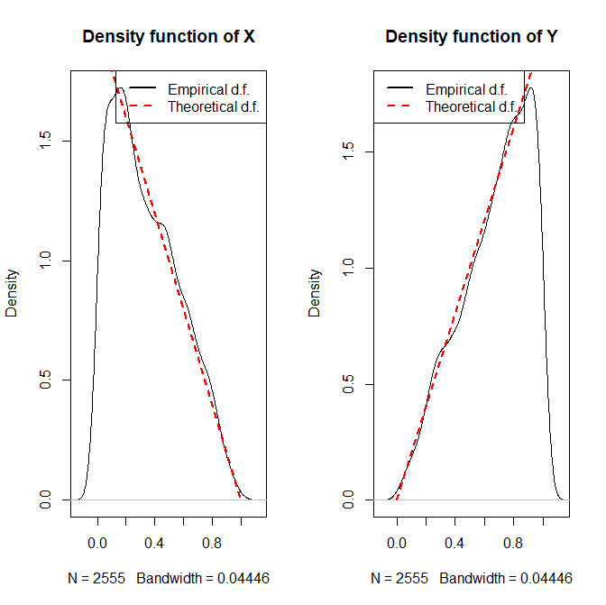
Finally let us verify that the simulated random sample indeed follows the given joint distribution.
We can see that over the set M, our theoretical expression of the 2 densities seem to correspond to the real distribution of X and Y.
To conclude, we can find the values of the means and the covariance thanks to R :
mean(new_df$x)
[1] 0.3417924
> mean(new_df$y)
[1] 0.6709302
> cov(new_df)
x y
x 0.05628505 0.02803615
y 0.02803615 0.05628175
Here is the code that I wrote to plot these figures :
library(ggplot2)
# simulate a two dimensional random sample from the joint distribution given by the two-dimensional density function
set.seed(11)
n = 5000
x <- runif(n, min = 0, max = 1)
y <- runif(n, min = 0, max = 1)
df = as.data.frame(cbind(x,y))
statement = df$y>df$x
new_df = df[statement,]
### Visualize the result of the data simulation
ggplot(new_df, aes(x=x, y=y) ) +
geom_point()
# visually verify independence/dependence of some given (two) random variables
qx <- NULL
qy <- NULL
for (i in 1:n){
qx <- c(qx, which(sort(new_df$x) == new_df$x[i]))
qy <- c(qy, which(sort(new_df$y) == new_df$y[i]))
}
qx <- qx / n
qy <- qy / n
plot(qy ~ qx, pch = 21, bg = "lightblue", xlab = "", ylab = "")
lines(lowess(qy ~ qx, f = 1), col = "red", lwd = 2)
# Use some proper graphical tools to verify that the simulated random sample indeed follows the given joint distribution.
par(mfrow=c(1,2))
xSeq <- seq(0,1, length = length(new_df$x))
plot(density(new_df$x), main = "Density function of X")
lines(2-xSeq*2 ~ xSeq, col = "red", lty = 2, lwd = 2)
legend("topright", legend = c("Empirical d.f.", "Theoretical d.f."), col = c("black", "red"), lty = c(1,2), lwd = c(2,2))
plot(density(new_df$y), main = "Density function of Y")
lines(2*xSeq ~ xSeq, col = "red", lty = 2, lwd = 2)
legend("topleft", legend = c("Empirical d.f.", "Theoretical d.f."), col = c("black", "red"), lty = c(1,2), lwd = c(2,2))
# Some summary statistics
mean(new_df$x)
mean(new_df$y)
cov(new_df)
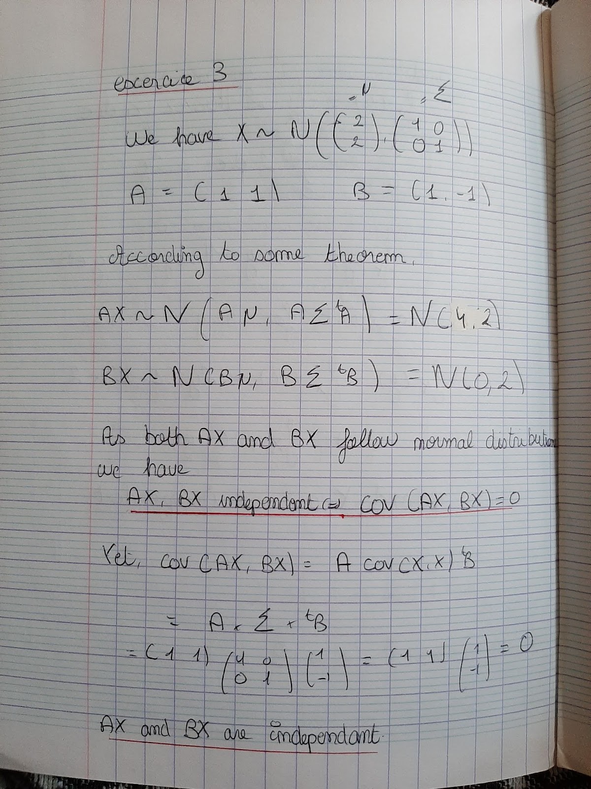
Third
task
Then
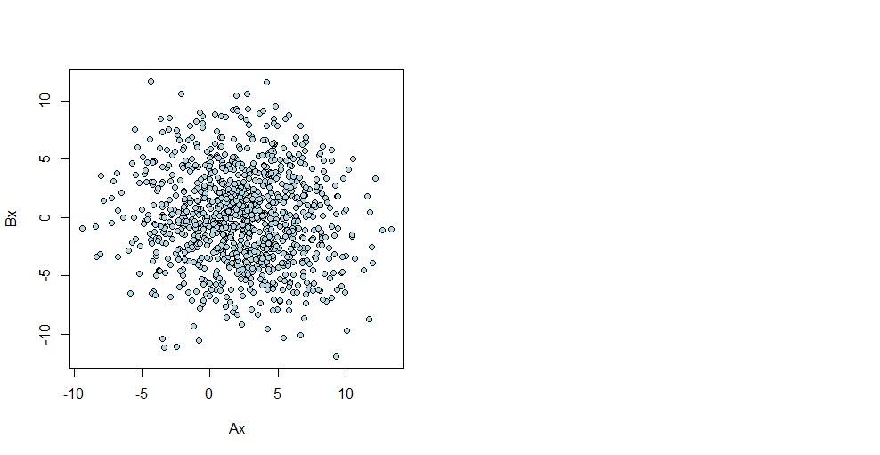
I plotted Bx Ax for n=1000 repetitions and we can show on the plot
that there is no cluster, the two variables are independent.
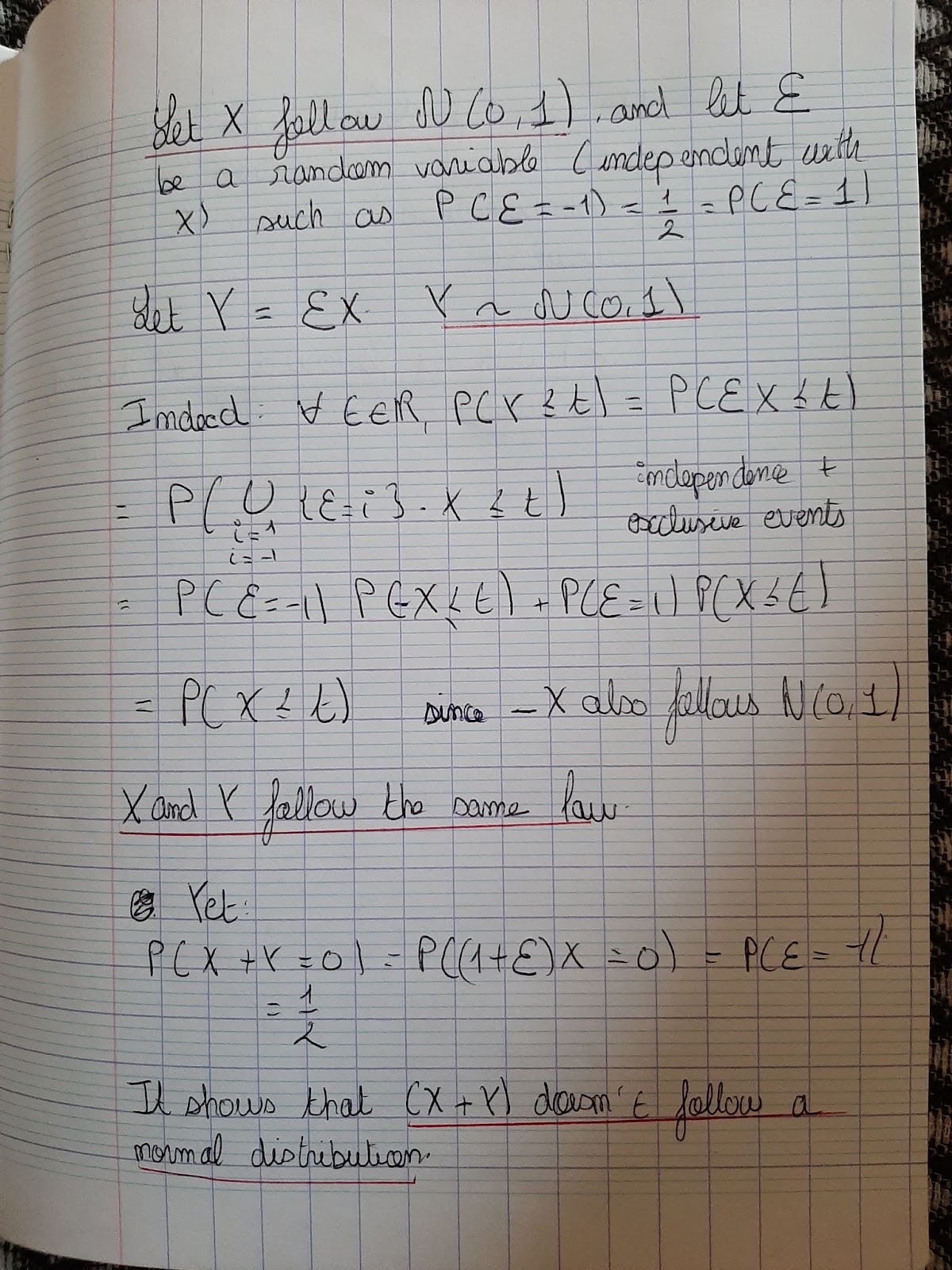
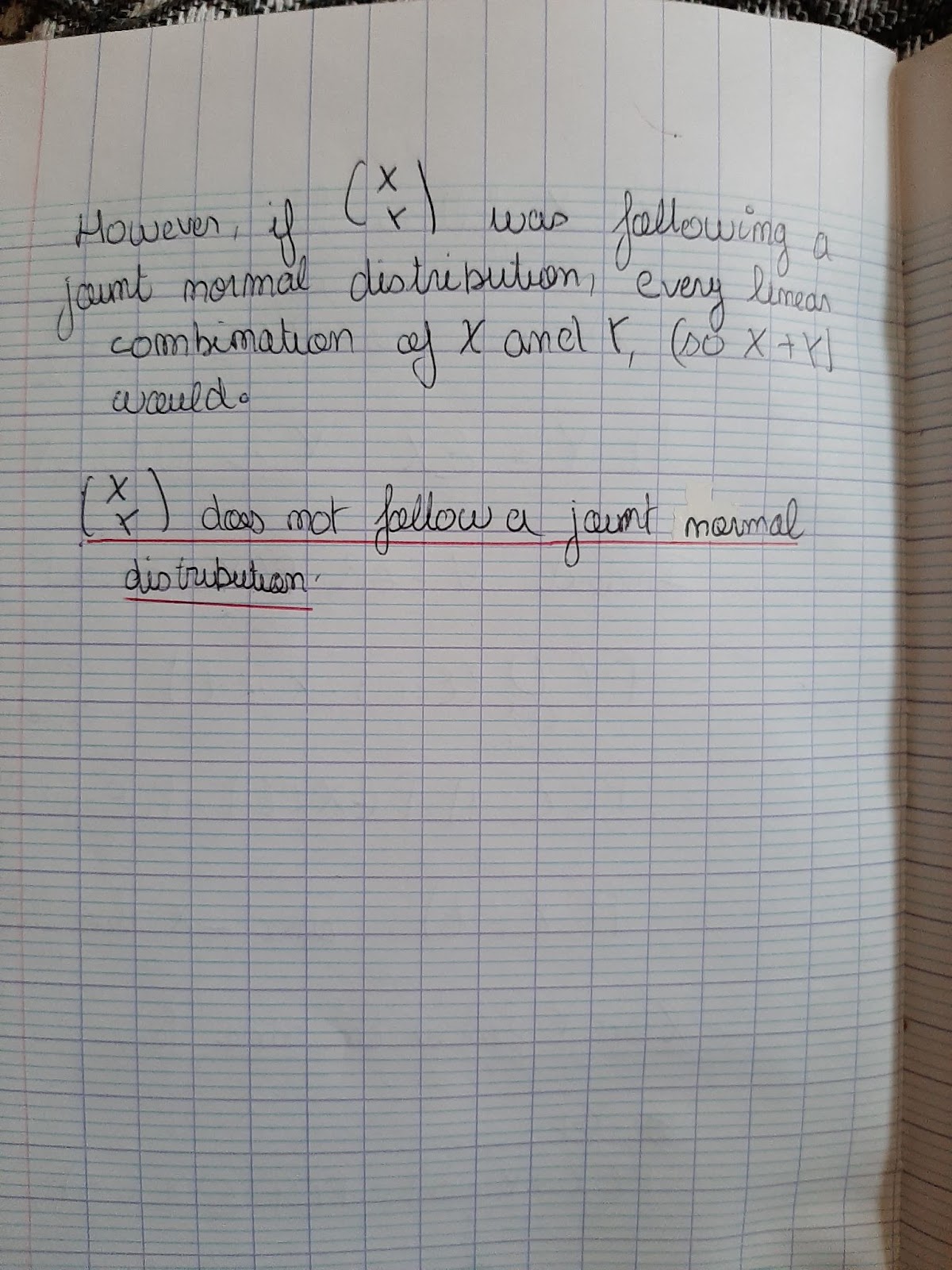
Then I found this example showing that two variables X and Y can follow normal distribution while the vector (X Y) fails to follow the joint normal distribution.
After the construction of X and Epsilon, I constructed Y.
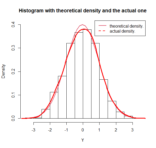
First of all, let us plot a histogram for Y’s values to show that it is actually following the distribution N(0,1). I also plotted the actual density and the theoretical one. We can see that they are quite similar. It helps us to admit that Y~N(0,1).
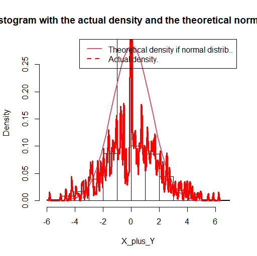
Then we can do exactly the same with (X+Y) to prove that it doesn’t follow a normal distribution. I plotted the histogram of the values, the actual density and the theoretical density that X+Y should have if it followed the normal joint distribution.
We see on the plot that the 2 densities are quite different. Subsequently, (X Y) can not follow the normal joint distribution.
4th
task
The
dataset ‘bottle.df” contains
the elemental concentration of five different elements (Manganese,
Barium, Strontium, Zirconium, and Titanium) in samples of glass taken
from six different Heineken bottles.
For this task we will focus only on two categories of bottles in order to make things easier : the odd and the even ones.
There are 60 glasses in each category.
We assume that these two categories can be divided into 2 samples which follow N5(μ1,Σ) and N5(μ2,Σ)
First,
let us
find
some characteristics of our 2 variables. X corresponds to the sample
yith odd bottles and Y to the one with the even ones.
¨
Mn Ba Sr Zr Ti
166.460 493.205 458.840 233.875 862.195
> apply(y, 2, mean)
Mn Ba Sr Zr Ti
182.715 560.340 496.645 270.215 885.170
Mn Ba Sr Zr Ti
Mn 80.20779 225.6802 189.3191 129.5542 430.7793
Ba 225.68021 755.5458 663.4261 451.9949 1369.3274
Sr 189.31905 663.4261 670.5909 420.2568 1250.6444
Zr 129.55421 451.9949 420.2568 420.3072 898.3936
Ti 430.77926 1369.3274 1250.6444 898.3936 2663.7500
> cov(y)
Mn Ba Sr Zr Ti
Mn 135.7961 429.5867 317.0914 230.7819 636.5789
Ba 429.5867 1437.4099 1098.6660 804.1941 2101.5749
Sr 317.0914 1098.6660 982.8721 636.2635 1665.6346
Zr 230.7819 804.1941 636.2635 619.1424 1210.1573
Ti 636.5789 2101.5749 1665.6346 1210.1573 3280.0475
Then we do the Hotelling T² test with the hypothesis H0 : μ1 = μ2
Let us now do this two-sample test for two multivariate means with the same unknown variance-covariance matrix. The test statistic is
nm(n+m−p−1)/(p*(n+m)²) * (O-E)T*S*(O-E)
We have n=m=60 and p=5, the number of variables, and O and E respectively the mean matrix of our two samples (odd and even bottles). We also have
S=1/(n+m)*(nS1+mS2)
with S1 and S2 our two covariance matrix.
Results of the test :
Numerator df: 5
Denominator df: 34
P-value: 0.002949
Comments
:
It seems that the test rejects the H0 hypothesis with P-value: 0.002949.
Now let us try to provide some inferential tool for the tested difference to have an idea about the confodence imtervals :
Lower Boundary Upper Boundary Mean Estimate
Number 2.412044 4.587956 3.50000
Mn 54.414148 61.977518 58.19583
Ba 162.307865 188.873802 175.59083
Sr 149.203842 169.291158 159.24750
Zr 74.703465 93.326535 84.01500
Ti 278.024818 304.430182 291.22750
5th
task
Let
us consider (X1,...,Xn)
that
follows N2(µ,Σ)
Our null hypothesis is H0 : Aµ=a with A=(2 -1) and a=0.
First of all we will consider that we do know that Σ= [[1,0.5],[0.5,1]].
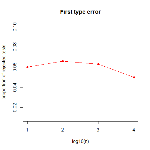
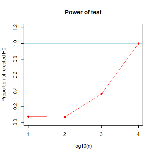
For several values of n, we will try to figure out the overall proportion of rejecting the null hypothesis for the significance level α=0.05. Under Ho, we have Tn the test statistic calculated thanks to Xn the sample mean value.
This test statistic should be compared to the corresponding quantile of its distribution
χ2(0.95)=3.8415. If Tn is bigger, the null hypothesis is greater.
We are going to calculate this test statistic several times for several values of n, in order to discover what is the first type of error probability. (Thanks to an R-code, we are going to do that and count how many times H0 is rejected).
We obtain :
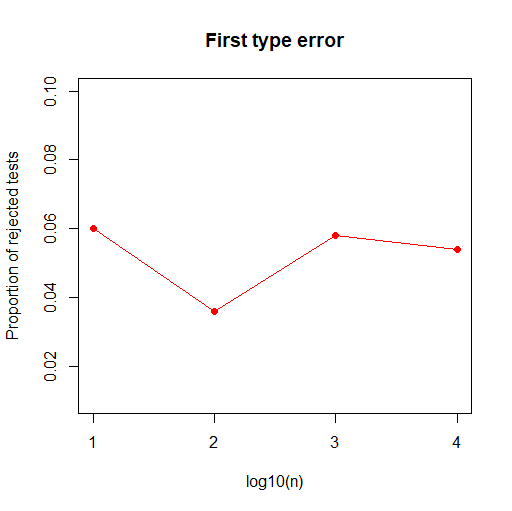
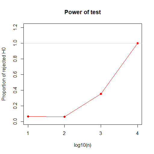
Now if we assume that we do not know Σ, we will have to approximate it with S, the sample variance covariance matrix. Under our H0, we have the test statistic Tn calculated with S, the sample covariance matrix.
that
is again to compare to the
corresponding
quantile of the Fisher distribution
F1,99(0.95)=3.9371. We reject H0 if Tn is greater.
Once again we are going to count how many times the null hypothesis is rejected in order to plot the probability of the first type error.
We
can see that in both cases, the results are similar
.
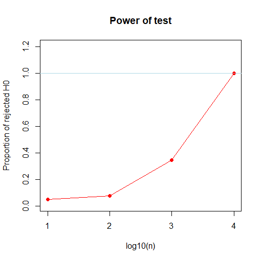
Then
we will suppose that we are under the H1 alternative hypothesis.
Aµ != a for several values of a.
We keep the same values for µ and Sigma but we are assuming that a=0.1, which is close from the H0 hypothesis, and then that a=100.
if we know sigma :
If we kmow Sigma
We can see that the results are again similar in both cases, Sigma known or not.
However for a H1 that is really far close H0, here a=0,1, we may need bigger values of n to reject H0.
6th
task
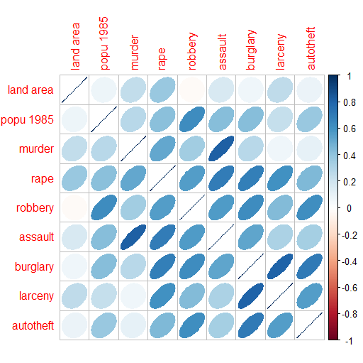
Let’s use the dataset “US Crime” which represents the amount of crimes in several parts of the United States. These crimes are divided into 7 categories and are represented according to the regions, the lands, the population or the superficy.
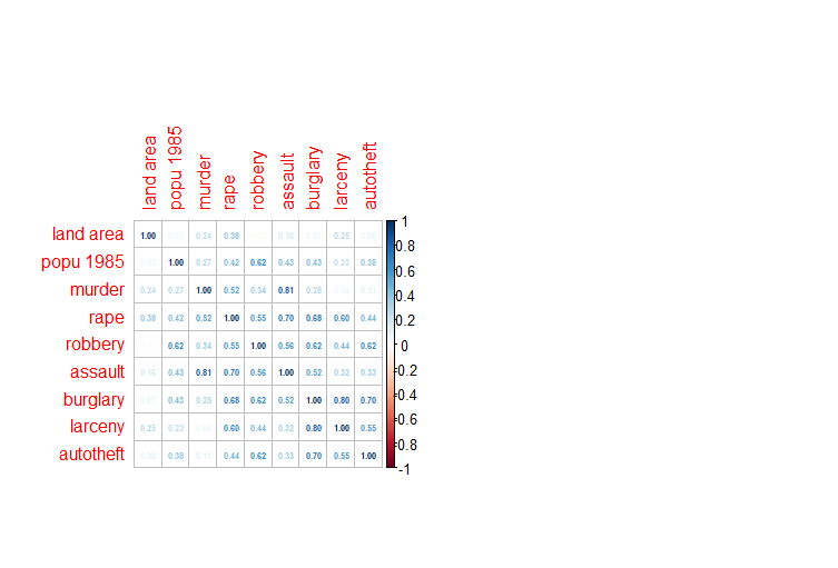
First, let us see the correlation between these several factors using this plot :
We
can see that the land area is not correlated to the crimes. However,
we can see a link between thefts and burgaries, murders and assaults.
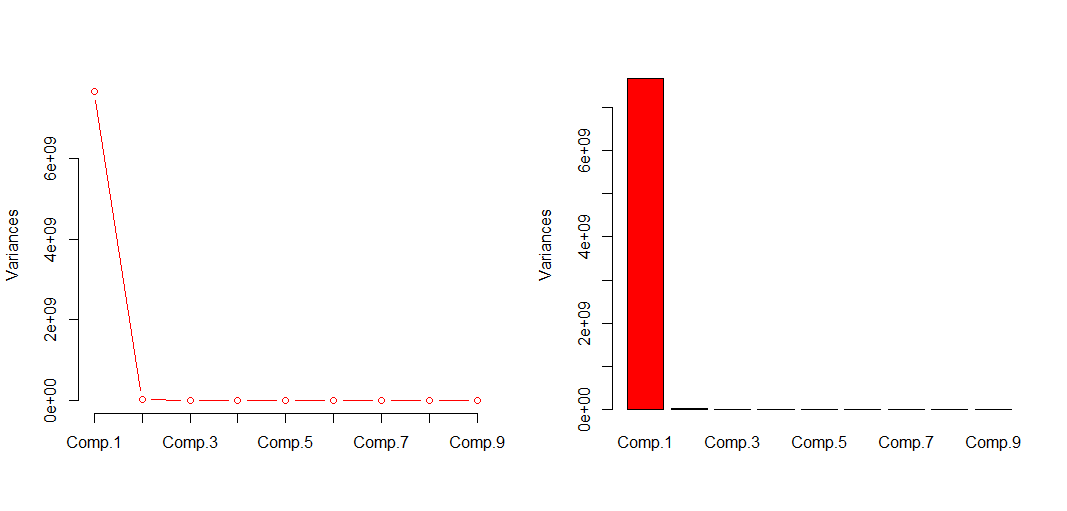
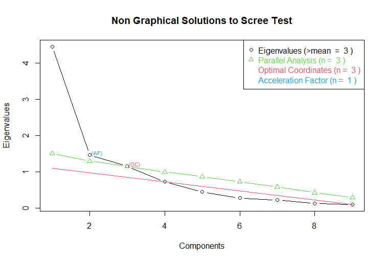
Now let’s do the PC analysis on the dataset.
Importance of components:
Comp.1 Comp.2 Comp.3 Comp.4 Comp.5 Comp.6
Standard deviation 8.752079e+04 5.010574e+03 7.245862e+02 1.949056e+02 1.261843e+02 6.388582e+01
Proportion of Variance 9.966573e-01 3.266618e-03 6.831302e-05 4.942787e-06 2.071733e-06 5.310462e-07
Cumulative Proportion 9.966573e-01 9.999239e-01 9.999922e-01 9.999971e-01 9.999992e-01 9.999997e-01
Comp.7 Comp.8 Comp.9
Standard deviation 4.392535e+01 3.888367e+00 1.939727e+00
Proportion of Variance 2.510463e-07 1.967242e-09 4.895583e-10
Cumulative Proportion 1.000000e+00 1.000000e+00 1.000000e+00
We
can see that the 2 or 3 first components are enough to cover almost
all the information.
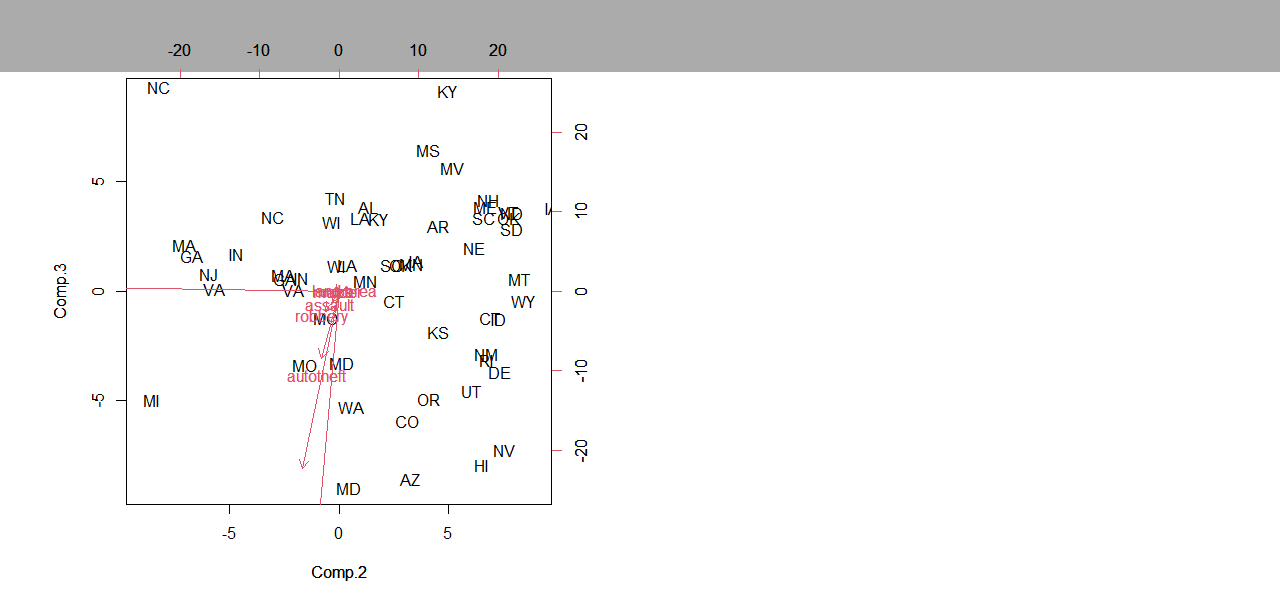
Now
let us see on the following figure the representation of the data
under the point of view of the components 2 and 3.
We can see that authotefts and robberies are more often done in western states, while murders and assaults predominate in the southern regions for instance.
7th
task
I used the dataset uscrime again to do the factor analysis.
Here I plotted again the correlation between the several factors :
Results from the Principal Components Analysis :
In the 6th task, we saw that the first principal component was enough to cover 99% of the information. We could even use the three first of them to cover more information.
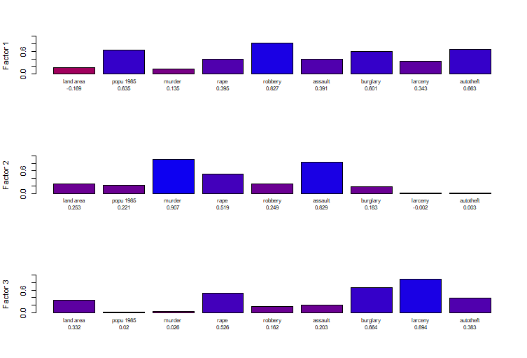
Let
us do the factor analysis yith 3 factors:
factanal(x = data, factors = 3, rotation = "varimax")
Uniquenesses:
land area popu 1985 murder rape robbery assault burglary
0.798 0.547 0.158 0.299 0.228 0.118 0.165
larceny autotheft
0.083 0.414
Loadings:
Factor1 Factor2 Factor3
popu 1985 0.635
robbery 0.827
autotheft 0.663
murder 0.907
assault 0.829
rape
burglary 0.601 0.664
larceny 0.894
land area
Factor1 Factor2 Factor3
SS loadings 2.362 1.988 1.841
Proportion Var 0.262 0.221 0.205
Cumulative Var 0.262 0.483 0.688
Test of the hypothesis that 3 factors are sufficient.
The chi square statistic is 19.31 on 12 degrees of freedom.
The p-value is 0.0814
On these plots we can see that the variable rape is correlated to all the factors. On the contrary, land area seems to be correlated with none of these 3 factors, as we can see in the first figure of this task.
The factor one seems to be related with the variables robbery and authoteft while the second one looks related to murder and assault and the third with burglary and lacerny.
The results are similar to the PCA because this previous analysis already gave us the link between robbery and authoteft and between murder and assault. However it had not given the one between burglary and larceny.
The results between these two analyses are similar. Nevertheless, the Factor Analysis doesn’t show the link between the variables and the locations (the 50 states).
Let us use the dataset Uscrime again.
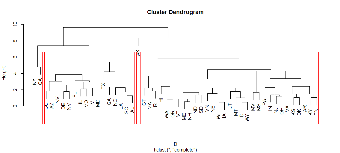
As there are 4 regions (West, South, Midwest, Northeast) I am going to perform the analysis by trying to create 4 relevant clusters.
Let’s construct a hierarchical dendrogram with 4 clusters after scaling the data.
We
can see that the clusters are not very relevant. Indeed, two of them
are very small and the big one is a mix of all the regions. However,
the 3rd cluster (CO, WY, OR,NM….) is only made of West states.
We can conclude that even if one cluster seems to be pertinent,this method is not very suitable here because it only considers the values of the data and not the way that they are grouped together (i.e. by regions here).
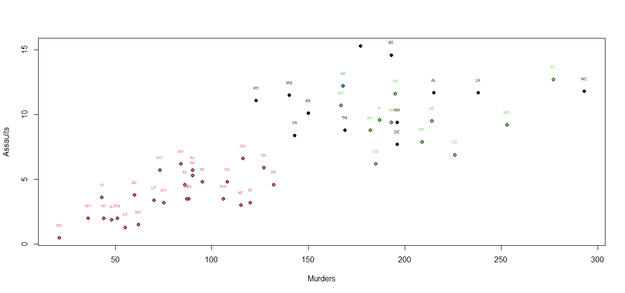
Let’s try a non-hierarchical method with the same number of clusters after scaling the data.
First, I decided to plot the analysis regarding two variables that are corelated : murder and assault :
We
can see that the clusters are not very similar : the state AK is
alone again, but the 3 other ones are a mix of every state.
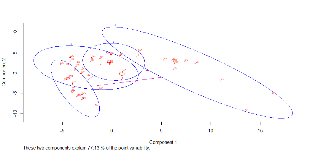
Then, I decided to use the library cluster and I obtained this :
We
again obtain different clusters that are not related at all with
regions.
All in all, once again this method may be useful to create clusters related to the numerical values of the dataset, but not to create ones that are related to a particular non numerical characteristic that we chose.
9th
task
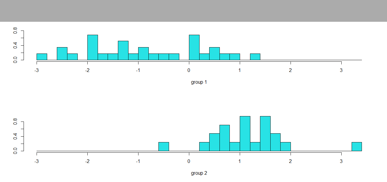
Let
us use the UScrime dataset again. I divided it into 2 groups : the
South and West states together and the Northeast and Midwest ones
together. I added one column “groupe” to the dataset
which takes the value 1 if the state is in the South or in the West
and 2 otherwise.
First, we apply the linear discriminant analysis :
We are interested in looking for a linear partition rule in R5 to classify 5 of the 7 crime variables (murder, rape, robbery, assault, autotheft) based on our 2 groups.
For the first group we can see that the values are dispersed, contrary to the second plot on which they are grouped around the value 1. It looks like the distinguishing value for these 2 groups is around 1.
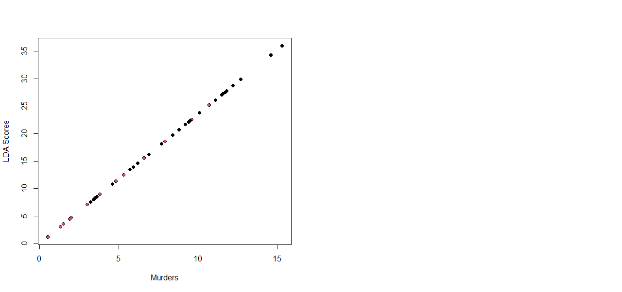
Then I plotted the scores of the LDA relatively to one covariate.
Here
we can see that the error rate of the partition is around 0.2 except
for the couple of variables robbery and auto theft, where it is
bigger.
Now let us use other method, the quadratic discriminant one, and let us plot the same graphs to see the differences or the similarities
With this second method we can see that the error rate is not better, again the couple robbery/auto theft has the bigger one.